What Is Web Design? A Complete Guide for Businesses
 Updated on May 07, 2026
Every year, businesses lose potential customers to websites that look outdated, load too slowly, or feel confusing to navigate. That problem starts long before development. It starts with web design. Most people assume website design is just about picking colors and fonts. In reality, it shapes how users think, feel, and act when they land on your site.
At TechTIQ Solutions, we define web design as the full practice of planning and building the visual, structural, and experiential layer of a website. This guide answers what is web design, how it works, and what separates a site that converts from one that just exists.
What Is Web Design?
So, what is the website design? At its core, web design is the process of planning, structuring, and building websites with a focus on how people experience them. It covers the visual layer, the information layout, and the logic behind every interaction a user has with a page.
Today, good website design must work equally well on every device. Mobile traffic now accounts for over 60% of global web browsing. A site that only looks good on desktop is already losing users.
What Does a Web Designer Do?
A web designer plans and builds the visual and structural layer of a website. Their job is to make sure the site looks good, feels intuitive, and works well for the people using it.
A web designer typically works on:
- The visual appearance and branding of a site
- The layout and structure of content across pages
- The clarity and flow of user interactions
- How the site adapts across desktop, tablet, and mobile
- The connection between visual design and user experience
Some web designers also work closely with developers to make sure the design translates correctly into a live, functional site.
Web Design vs. Web Development: Key Differences
Web design and web development are two different disciplines. They work together, but they solve different problems.
Web design focuses on the user-facing side of a website. It covers layout, visuals, typography, color, and the overall experience a visitor has on the site.
Web development focuses on the technical side. Developers write the code that makes the site function. This includes databases, server logic, and application behavior.
A simple way to think about it:
- Website design is how a site looks and feels
- Website development is how a site works and runs
Most professional projects need both. A well-designed site with poor development breaks. A well-built site with poor design loses users. At TechTIQ Solutions, we handle both under one roof, so nothing gets lost between the two. You can explore how we approach web design and development in Singapore as a combined service.
What Are the Core Principles of Web Design?
Creating a good design is not random. It follows a set of principles that guide every layout, color, and spacing decision. These principles exist to make a site easier to use and more effective at communicating its message.
Visual hierarchy: Controls what users notice first on a page. It uses size, color, contrast, and position to guide the eye from the most important element to the least.
Balance: Creates a sense of stability across a page. It does not mean every element needs to be symmetrical. It means the overall layout feels visually even, and nothing looks out of place.
Contrast: Makes the most important elements stand out. Dark text on a light background, a bold CTA button against a neutral section, these are all deliberate contrast decisions. Without contrast, users have no clear signal about where to look.
Emphasis: Takes contrast one step further. Every page should have one clear focal point that draws the eye first. When everything on a page competes for attention equally, users leave without taking any action.
Movement: Guides the eye through a page in a deliberate sequence. Movement can be created through visual cues like arrows, diagonal lines, or animation. When used intentionally, it directs users toward the next action you want them to take.
White space: The empty space around elements on a page. It is not wasted space. It is a deliberate design tool. Spacing around a headline improves readability. A CTA button with room to breathe gets more clicks. Pages with generous white space feel premium and professional, while pages without it feel cluttered and hard to scan.
Unity: Every page on a site should feel like it belongs to the same brand. Consistent fonts, colors, button styles, and spacing all create this effect. Without unity, a website feels unfinished and untrustworthy.
Rhythm: Refers to repeating visual patterns across a page or site. Consistent spacing between sections, predictable navigation placement, and repeated design elements all contribute to this effect. Users feel comfortable on sites with strong rhythm because they know what to expect next.
What Are the Visual Elements of Web Design?
The visual elements of a website shape how users perceive a brand the moment they land on a page. Each element serves a specific purpose, and when they work together, they create a cohesive and credible experience.
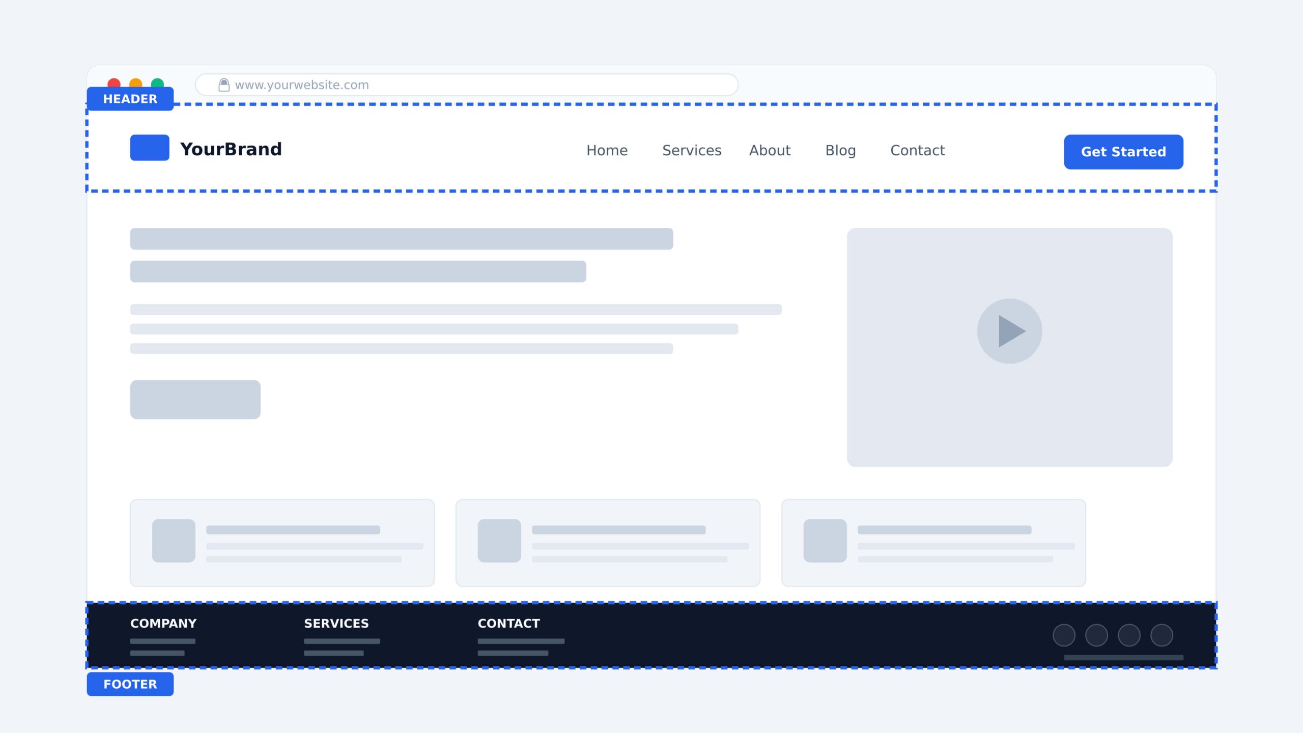
Header and Footer
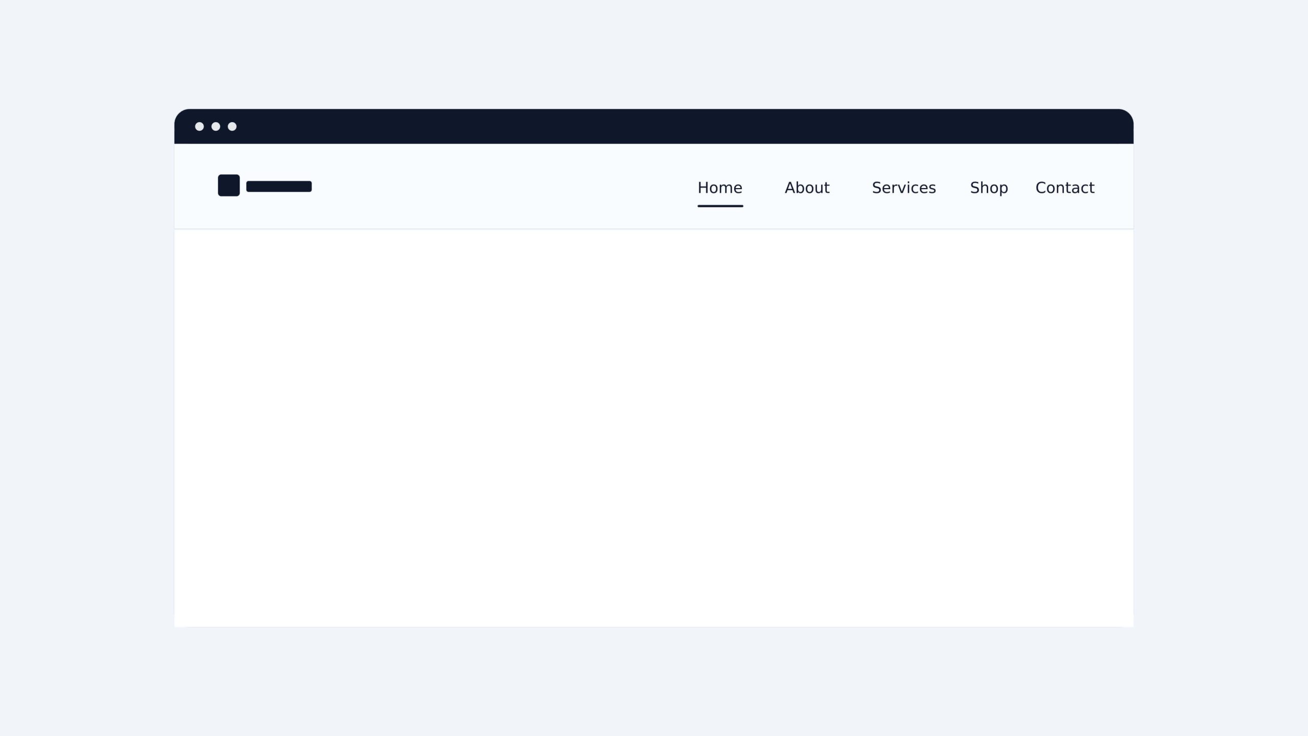
The website header is the first thing users see. It sits at the top of every page and typically holds the logo, navigation menu, and primary call to action. A well-designed header gives users immediate orientation. They know where they are, what the site offers, and where to go next.
The website footer anchors the bottom of every page. It is often the last thing a user sees before leaving, making it a practical place for secondary navigation, contact details, social media links, and legal information. A strong footer catches users who scroll past the main content without converting.
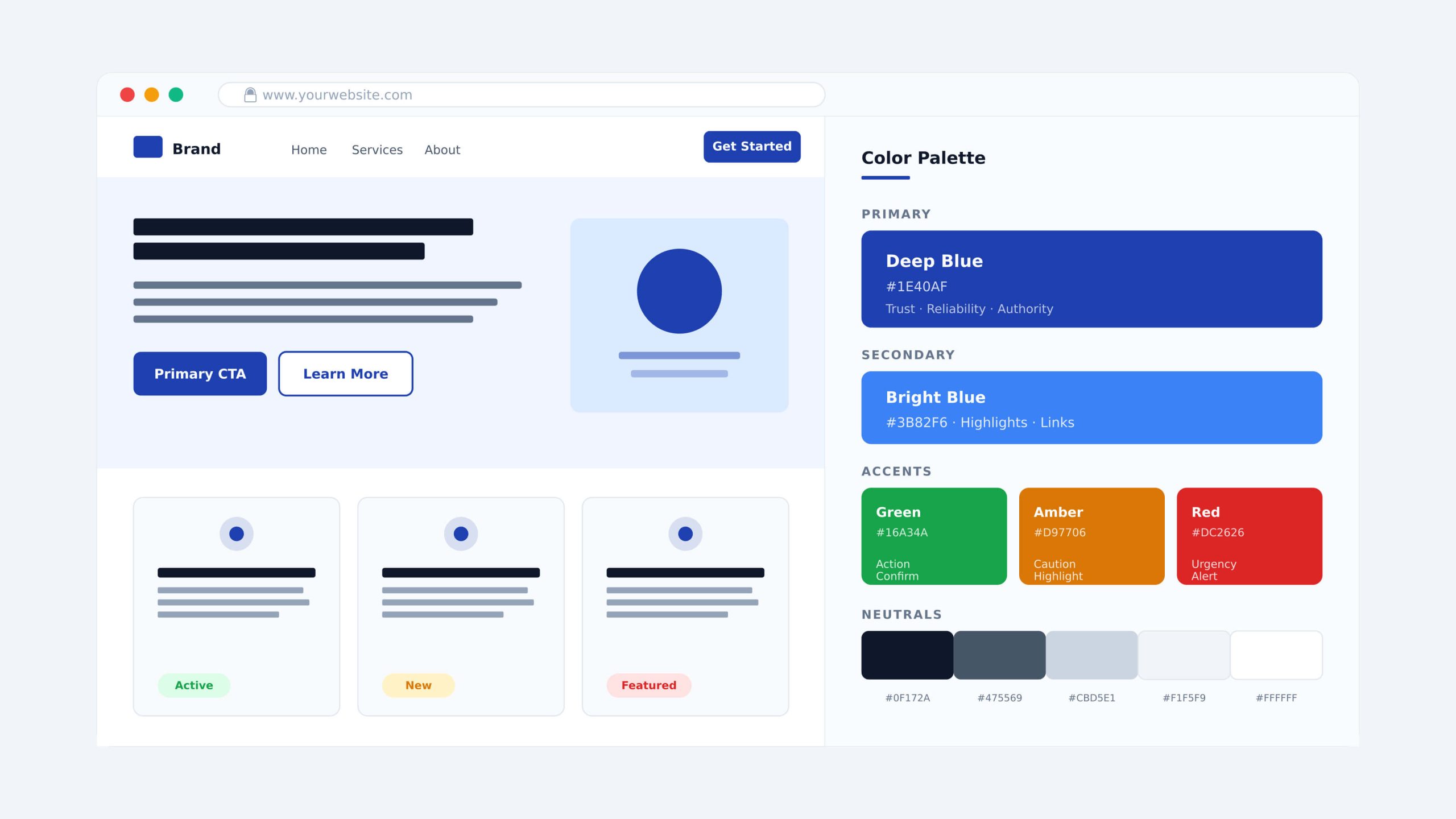
Color Scheme
A color scheme does more than make a site look attractive. It sets the emotional tone, reinforces brand identity, and guides user attention. Most sites work with three layers of color: a dominant primary color, a secondary color used more sparingly, and accent colors applied to highlight specific elements like CTA buttons or key headings.
Color also carries functional meaning. Blue builds trust, red creates urgency, and green signals action or confirmation. These associations influence how users feel and behave on a page, often without them realizing it.
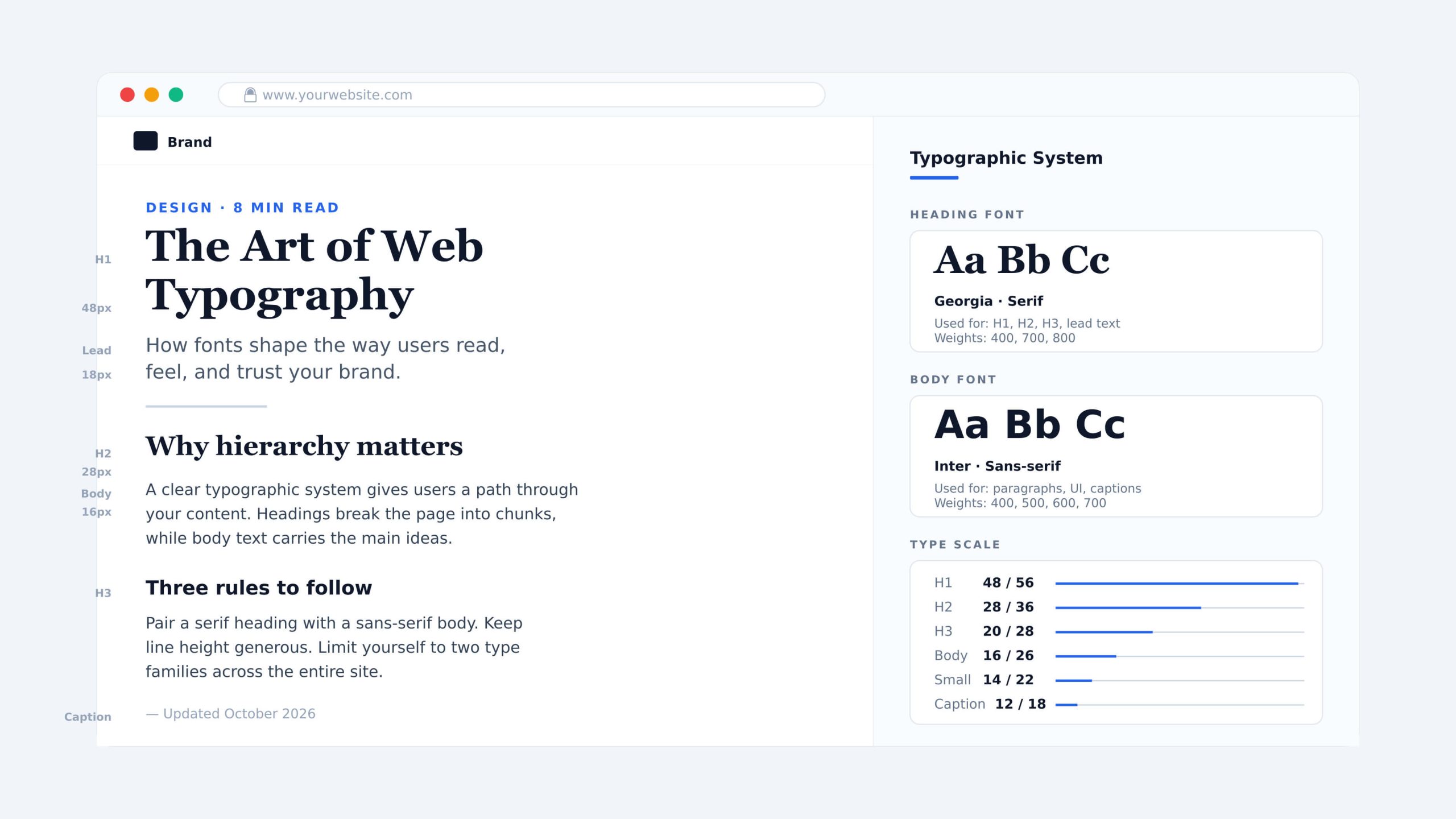
Typography
Typography shapes how users read and feel about content. Font choice, size, weight, and line spacing all affect readability and brand perception.
A clear typographic system typically includes a primary font for headings, a secondary font for body text, and consistent sizing rules across all pages. When typography is inconsistent, even well-written content feels unprofessional. When it is done well, users absorb information faster and trust the brand more.
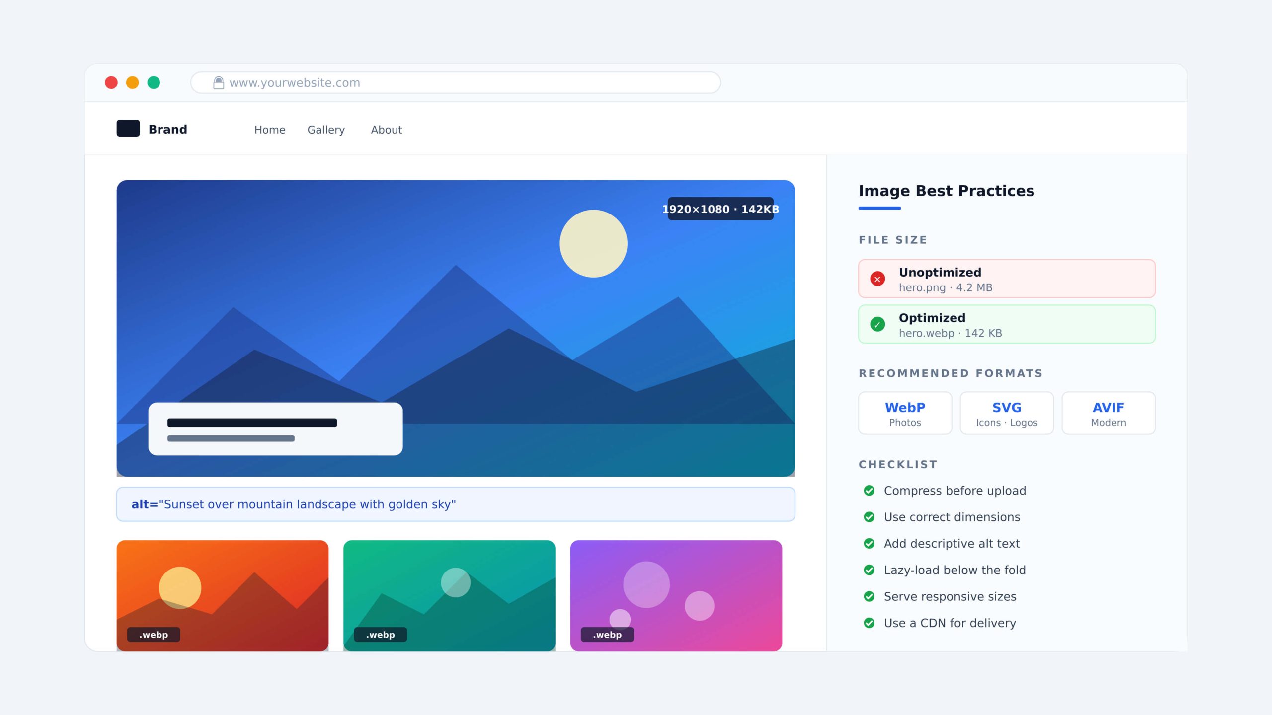
Imagery
Imagery communicates faster than text. A single strong image can reinforce a brand message, build emotional connection, or demonstrate a product in ways that paragraphs cannot.
The key consideration is performance. Large, unoptimized images slow down page load times and hurt both user experience and SEO rankings. Every image on a site should be compressed, properly sized, and accompanied by descriptive alt text.
Animation
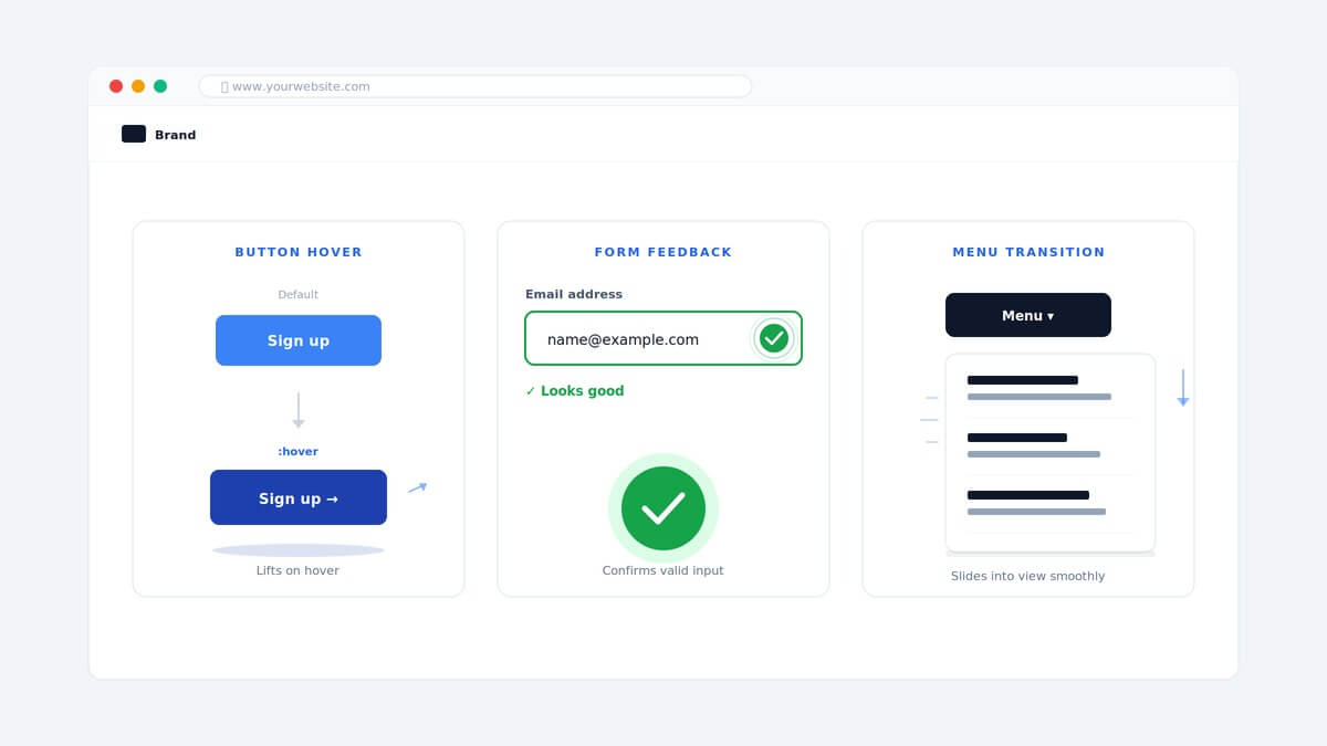
Animation adds movement and feedback to a site. Used well, it makes interactions feel responsive and natural. A button that reacts on hover, a menu that transitions smoothly, a scroll-triggered element that draws attention to a key message. These are all examples of animation working in service of the user.
The rule is restraint. Animation that exists purely for visual effect slows performance and distracts users from taking action.
What Are the Functional Elements of Web Design?
Functional elements determine how a website works. A site can look visually polished and still fail if users cannot navigate it easily, if it loads too slowly, or if search engines cannot index it properly.
Navigation
Website navigation is what allows users to move between pages and find what they need. A poorly structured navigation system is one of the fastest ways to lose a visitor.
Most sites use one of several navigation patterns depending on their structure and audience:
- Classic navigation menu: This is the most common pattern in web design. It sits in the website header and presents navigation items as a horizontal list, making it immediately familiar to most users.
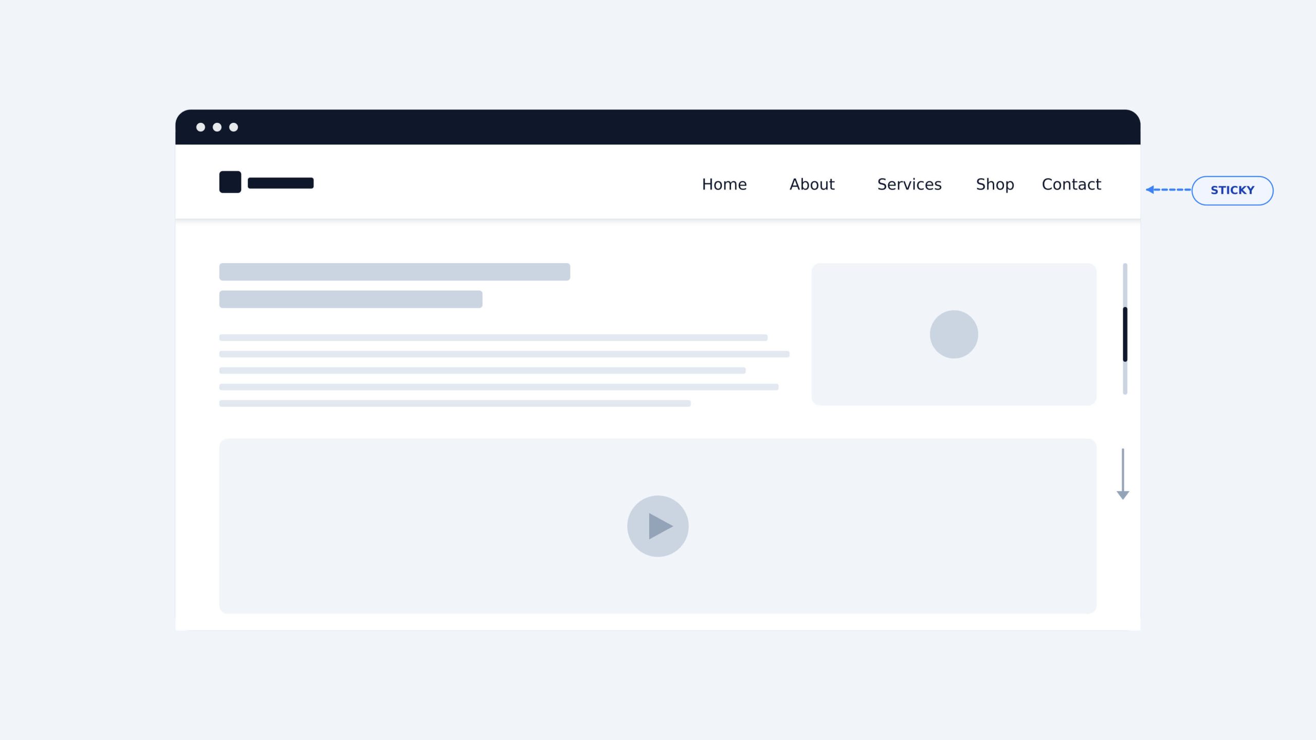
- Sticky menu: A menu that stays fixed at the top of the screen as users scroll down the page. It keeps navigation accessible at all times without requiring users to scroll back up.
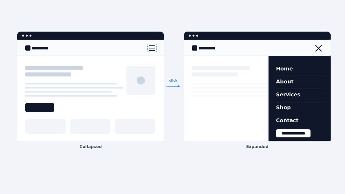
- Hamburger menu: A collapsed icon made up of three horizontal lines that expands into a full menu when clicked. It is widely used on mobile where screen space is limited.
- Dropdown menu: A menu that reveals a list of additional items when a user hovers over or clicks a parent item. It works well for sites with multiple categories or service pages.
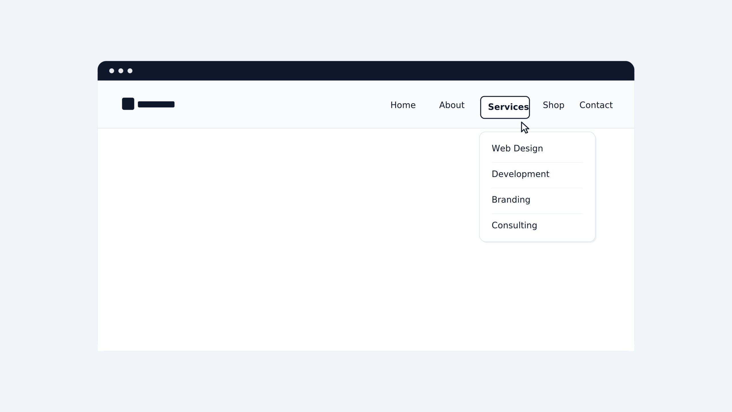
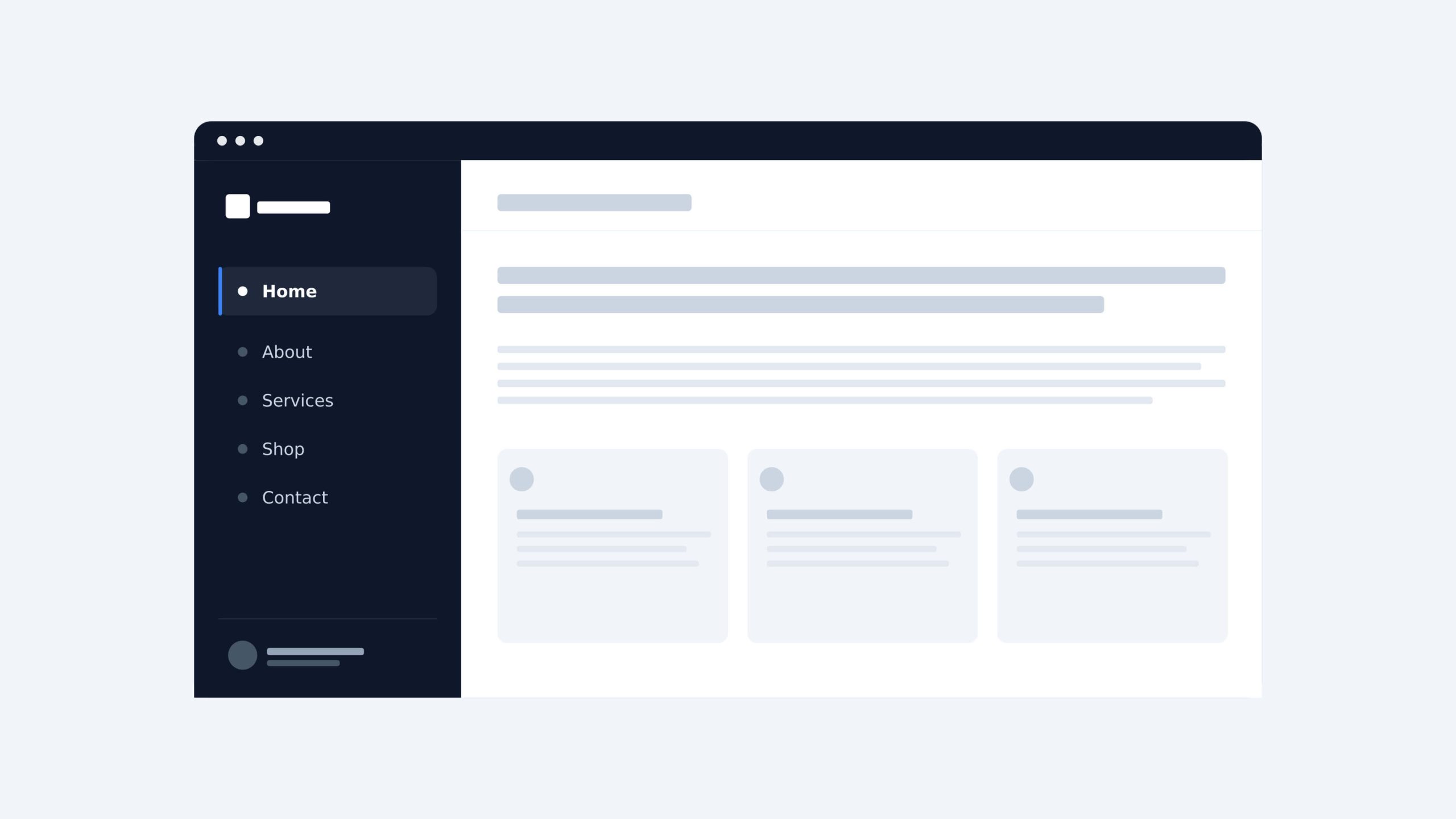
- Sidebar menu: A vertical list of navigation items placed on the left or right side of a page. It is commonly used on dashboards, documentation sites, or pages with deep content hierarchies.
Regardless of the pattern used, users should be able to reach any page on the site within two to three clicks.
Page Speed
Page speed measures how quickly a site fully loads after a user arrives. According to Google research, 40% of users will leave a page that takes longer than three seconds to load. That means a slow site is actively losing users before they have a chance to engage with the content.
Several factors affect page speed: unoptimized images, bloated code, too many third-party scripts, and poor server performance. Regular performance audits using tools like Google PageSpeed Insights help identify and fix these issues before they impact rankings and conversions.
Accessibility
Accessibility ensures that all users can interact with a site without barriers. Key practices include sufficient color contrast between text and background, keyboard navigability, properly labeled form fields, and descriptive alt text for images.
Beyond being good practice, accessibility has a direct impact on SEO performance and overall usability. Sites built with accessibility in mind tend to have cleaner code, faster load times, and lower bounce rates.
SEO and CRO
SEO and conversion rate optimization (CRO) are not add-ons to website design. They need to be considered from the start.
A well-structured website layout helps search engines crawl and index content correctly. Clear heading hierarchy, fast load times, mobile responsiveness, and clean URL structures all feed directly into SEO performance.
CRO focuses on turning visitors into leads or customers. Strategic placement of CTA buttons, trust signals, and simplified forms all come from design decisions. A site can rank well and still fail to convert if its design does not guide users toward a clear action.
What Is Responsive Web Design?
Responsive web design is an approach that allows a website to adapt automatically to any screen size. Instead of building separate versions for desktop and mobile, a responsive site uses a single codebase that adjusts its layout, images, and text based on the user’s screen resolution.
Responsive vs. Adaptive Web Design
Responsive and adaptive website design are often used interchangeably, but they work differently.
Responsive design uses fluid, flexible layouts that adjust continuously to any screen size. One design scales up or down to fit whatever device is being used.
Adaptive design delivers predefined layouts based on the detected device. Instead of one flexible layout, the server loads a specific version of the site depending on the screen size or device type.
For most businesses, responsive web design is the practical choice. It is easier to maintain, more cost-effective to build, and performs better across the wide variety of devices users have today.
Read more: 8 Core Responsive Web Design Principles & Best Practices
What Are the Main Types of Website Design?
There is no single approach to website design. The right type depends on your business goals, budget, and the experience you want to deliver to users.
Static Web Design
A static website displays the same content to every visitor. The pages are pre-built and do not change unless a designer manually updates them. Static sites are fast, simple, and cost-effective, making them a good fit for small businesses or informational sites with limited content needs.
Dynamic Web Design
A dynamic website pulls content from a database and generates pages in real time. Content can change based on user behavior, login status, or other variables. Most modern business websites, ecommerce stores, and platforms are built on dynamic website design.
Custom Web Design
Custom web design is built from scratch to match a specific brand, audience, and set of business goals. Nothing is borrowed from a template. Every layout, interaction, and visual element is designed intentionally. This approach takes more time and investment, but it produces a site that is unique, scalable, and fully aligned with the brand.
Template-Based Web Design
Template-based web design uses pre-built layouts as a starting point. Designers customize colors, fonts, images, and content within the template structure. It is faster and more affordable than custom design, and works well for startups or businesses that need a professional site up quickly.
Landing Page Design
A landing page is a standalone page built for one specific goal, typically to capture a lead or drive a conversion. Unlike a full website, a landing page removes distractions and focuses the user on a single action. It is a core tool in digital marketing and conversion rate optimization (CRO).
What Is the Web Design Process From Start to Launch?
A professional website design project follows a structured process. Each stage builds on the previous one, and skipping any step usually creates problems later.
Discovery and Requirements Gathering
This is where the project is defined. The team collects information about the business, target audience, goals, and technical requirements. A clear brief at this stage prevents costly revisions later.
Wireframing and Prototyping
Wireframes are simple, structural blueprints of each page. They map out the layout and content placement before any visual design begins. Prototypes add interactivity to test user flows before development starts.
Visual Design and Development
This is where the site takes shape visually. Designers apply typography, color schemes, imagery, and UI elements to the wireframes. Developers then build the functional site based on the approved designs.
Testing, Launch, and Iteration
Before launch, the site is tested across devices, browsers, and screen sizes. Page speed, accessibility, and functionality are all checked. After launch, the process does not stop. Real user behavior informs ongoing improvements.
Website Design Trends Shaping 2026
Website design continues to evolve. The trends gaining the most traction in 2026 are not purely aesthetic. They are driven by user behavior, search engine requirements, and advances in technology.
AI-Assisted Design and Personalization
AI is changing how websites are designed and experienced. Design tools now use AI to generate layouts, suggest color palettes, and automate repetitive tasks. On the user side, AI enables personalization at scale, serving different content or experiences based on user behavior, location, or preferences.
Micro-Interactions and Dynamic User Feedback
Micro-interactions are small, functional animations that respond to user actions. A button that changes color on hover, a form field that confirms valid input, a menu that slides in smoothly. These details make a site feel responsive and alive. Done well, micro-interactions reduce friction and improve the overall user experience.
Accessibility-First and Inclusive Design Standards
Accessibility is moving from a compliance checkbox to a core design principle. More businesses are adopting accessibility-first approaches from the start of a project rather than retrofitting after launch. This produces sites that work better for all users and perform better in search rankings.
Full Integration of SEO, CRO, and UX From Day One
The strongest website design projects in 2026 treat SEO, CRO, and UX as one connected system. Search visibility, conversion performance, and user satisfaction are no longer handled separately. They are built into the design decisions from the first wireframe.
Why Does Professional Web Design Matter for Your Business?
A website is often the first interaction a potential customer has with your business. Professional website design determines whether that interaction builds confidence or drives them away.
First Impressions and Brand Credibility
Users form an opinion about a website in under 50 milliseconds. That judgment is based almost entirely on visual design. A site that looks outdated or inconsistent signals that the business behind it may not be trustworthy.
Quality web design communicates credibility before a single word is read. Consistent branding, clean layouts, and polished visuals tell users they are in the right place.
Web Design and Conversions
Good website design is a direct driver of business results. Strategic placement of CTA buttons, clear visual hierarchy, and frictionless navigation all guide users toward taking action.
Research from Forrester shows that a well-designed user experience can increase conversion rates by up to 200%. For businesses investing in digital growth, website design is not a cost. It is a revenue lever.
Web Design for Startups and SMEs in Singapore with TechTIQ Solutions
For startups and SMEs in Singapore, web design decisions carry extra weight. Budget constraints mean every design choice needs to deliver measurable value. At the same time, the Singapore market is competitive, and a poorly designed site makes it easy for users to choose a competitor instead.
The most effective approach for growing businesses is to invest in a custom web design built around specific business goals, one that scales as the company grows and is optimized for both search visibility and conversions from day one. If you are looking for a reliable web design and development company in Singapore, TechTIQ Solutions works specifically with startups and SMEs at this stage.
FAQs
How much does professional web design cost for a small business?
The cost of professional website design varies depending on scope, complexity, and the team involved. A template-based site typically costs less than a fully custom build.
In Singapore, pricing can range from a few thousand SGD for a basic site to significantly more for a custom build with advanced functionality.
For startups and SMEs, the more important question is what return the investment will generate, not just the upfront cost.
How long does a typical web design project take?
A standard website design project takes anywhere from four to twelve weeks, depending on the size of the site, the number of revisions, and how quickly feedback is provided. Custom projects with complex functionality typically take longer than template-based builds.
How do I choose the right web design agency for my business?
Start by looking at their portfolio. The work should demonstrate strong visual design, clear user experience, and results across different industries. Ask about their process, how they handle revisions, and whether they offer both website design and development under one roof.
For startups and SMEs in Singapore, it also helps to choose an agency that understands the local market, your target audience, and your business goals, not just the technical requirements of building a site.
What are web-safe fonts in web design?
Web safe fonts are fonts that display correctly across all devices and browsers without requiring additional loading. Classic examples include Arial, Georgia, and Times New Roman.
Most modern websites use cloud-based font libraries like Google Fonts instead, which offer a much wider range of options while still ensuring consistent display for every visitor.
Conclusion
Understanding what web design is is the first step toward building a website that works for your business. Every decision, from layout and typography to responsiveness and performance, shapes how users experience your brand and whether they choose to act on it.
For startups and SMEs, getting these foundations right from day one makes everything else easier, from SEO to conversions to long-term growth.
If you are ready to build something that delivers real results, get in touch with TechTIQ Solutions and let’s talk about your project.
Related articles

10 Web Security Best Practices for Singapore Startups and SMEs in 2026
 Bruce Pham
  15 May 2026
 ")
8 Core Responsive Web Design Principles & Best Practices (2026)
29 Apr 2026 
What Is Web Development? The Complete 2026 Beginner’s Guide
26 Apr 2026 
Top 14 Web Development Best Practices 2026 for Better Results
20 Apr 2026 
Custom Web Design: The Good and The Bad
26 Dec 2024 
Web Design Trends to Follow in 2026
26 Dec 2024 
Web Development Trends: Top 8 Trends You Should Know
26 Dec 2024 
How to calculate Web Design and Web Development Cost?
26 Dec 2024 
Cost Effective Website Development in Singapore
26 Dec 2024 